
The Power of Colour Psychology in Web Design | Johor Web Design Tips
Colour plays a crucial role in web design, influencing user behaviour, emotions, and conversion rates. Understanding colour psychology can help businesses create websites that attract visitors and drive action. In this guide, we explore how to use colour in web design effectively and share expert Johor Web Design tips to maximise impact.
Read more articles:
- 2025 Website Design Trends for Standout Site | Johor Web Design
- Top eCommerce Trends 2025 in Digital Market | Johor Web Design
What is Colour Psychology?
Colour psychology is the study of how colours affect human emotions and decision-making. Each colour triggers specific psychological responses, which can influence how users interact with a website. By applying the right colours strategically, brands can create trust, encourage engagement, and boost conversions.
How Red Stimulates Purchases
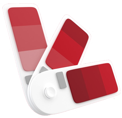
Red is a powerful colour often linked to urgency, passion, and excitement. Many eCommerce brands use red for call-to-action (CTA) buttons, sales banners, and promotions. This is because:
- Red creates a sense of urgency, prompting quick decisions.
- It increases heart rate, making users feel more energized.
- Commonly used by food and retail brands (e.g. McDonald’s, Shopee) to drive impulse buying.
Why Blue Builds Trust and Professionalism
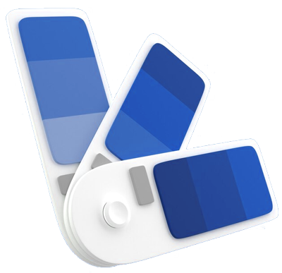
Blue is one of the most commonly used colours in web design, especially in corporate, finance, and tech industries. This is because:
- Blue represents trust, security, and reliability.
- It creates a calming effect, making users feel comfortable.
- Social media platforms like Facebook and LinkedIn use blue to encourage long-term engagement.
Other Key Colours in Web Design
- Orange
Encourages enthusiasm and creativity; great for CTA buttons. - Yellow
Represents happiness and grabs attention but should be used moderately. - Green
Associated with nature, health, and finance; often used for eco-friendly brands. - Black
Signifies luxury and sophistication, commonly seen in high-end fashion and tech brands.
Johor Web Design Tips: Choosing the Right Colours for Your Website
1️⃣ Define Your Brand Identity
Ensure the colours align with your brand’s personality.
2️⃣ Consider Your Target Audience
Different demographics respond differently to colours.
3️⃣ Use Colour Contrast for Readability
High contrast improves text visibility and user experience.
4️⃣ Apply Colour Strategically
Use bright colours for CTAs and neutral tones for backgrounds.
Conclusion
Understanding colour psychology and applying colour in web design strategically can enhance user experience, strengthen branding, and boost conversions. Whether you’re designing a corporate website or an eCommerce platform, following these Johor Web Design tips will help you create a visually compelling and effective site.
Need expert advice on web design? Contact Johor Web Design today!
Ready to take your website to the next level?
At Johor Web Design, we specialize in creating customized websites that not only look great but also drive results. Whether you need an e-commerce platform, a professional portfolio, or a business website, our team has the expertise to help you succeed online. Don’t hesitate to reach out! Contact us through WhatsApp for a quick consultation or visit our Service Page to explore how we can elevate your online presence. Let’s work together to make your website a powerful tool for your business!
Web Design & Development | Google SEO Services | Web Maintenance | Digital Marketing


The Power of Colour Psychology in Web Design | Johor Web Design Tips
Colour plays a crucial role in web design, influencing user behaviour, emotions, and conversion rates. Understanding colour psychology can help businesses create websites that attract visitors and drive action. In this guide, we explore how to use colour in web design effectively and share expert Johor Web Design tips to maximise impact.
Read more articles:
- 2025 Website Design Trends for Standout Site | Johor Web Design
- Top eCommerce Trends 2025 in Digital Market | Johor Web Design
What is Colour Psychology?
Colour psychology is the study of how colours affect human emotions and decision-making. Each colour triggers specific psychological responses, which can influence how users interact with a website. By applying the right colours strategically, brands can create trust, encourage engagement, and boost conversions.
How Red Stimulates Purchases
Red is a powerful colour often linked to urgency, passion, and excitement. Many eCommerce brands use red for call-to-action (CTA) buttons, sales banners, and promotions. This is because:
- Red creates a sense of urgency, prompting quick decisions.
- It increases heart rate, making users feel more energized.
- Commonly used by food and retail brands (e.g. McDonald’s, Shopee) to drive impulse buying.
Why Blue Builds Trust and Professionalism
Blue is one of the most commonly used colours in web design, especially in corporate, finance, and tech industries. This is because:
- Blue represents trust, security, and reliability.
- It creates a calming effect, making users feel comfortable.
- Social media platforms like Facebook and LinkedIn use blue to encourage long-term engagement.
Other Key Colours in Web Design
- Orange
Encourages enthusiasm and creativity; great for CTA buttons. - Yellow
Represents happiness and grabs attention but should be used moderately. - Green
Associated with nature, health, and finance; often used for eco-friendly brands. - Black
Signifies luxury and sophistication, commonly seen in high-end fashion and tech brands.
Johor Web Design Tips: Choosing the Right Colours for Your Website
1️⃣ Define Your Brand Identity
Ensure the colours align with your brand’s personality.
2️⃣ Consider Your Target Audience
Different demographics respond differently to colours.
3️⃣ Use Colour Contrast for Readability
High contrast improves text visibility and user experience.
4️⃣ Apply Colour Strategically
Use bright colours for CTAs and neutral tones for backgrounds.
Conclusion
Understanding colour psychology and applying colour in web design strategically can enhance user experience, strengthen branding, and boost conversions. Whether you’re designing a corporate website or an eCommerce platform, following these Johor Web Design tips will help you create a visually compelling and effective site.
Need expert advice on web design? Contact Johor Web Design today!
Ready to take your website to the next level?
At Johor Web Design, we specialize in creating customized websites that not only look great but also drive results. Whether you need an e-commerce platform, a professional portfolio, or a business website, our team has the expertise to help you succeed online. Don’t hesitate to reach out! Contact us through WhatsApp for a quick consultation or visit our Service Page to explore how we can elevate your online presence. Let’s work together to make your website a powerful tool for your business!
Web Design & Development | Google SEO Services | Web Maintenance | Digital Marketing